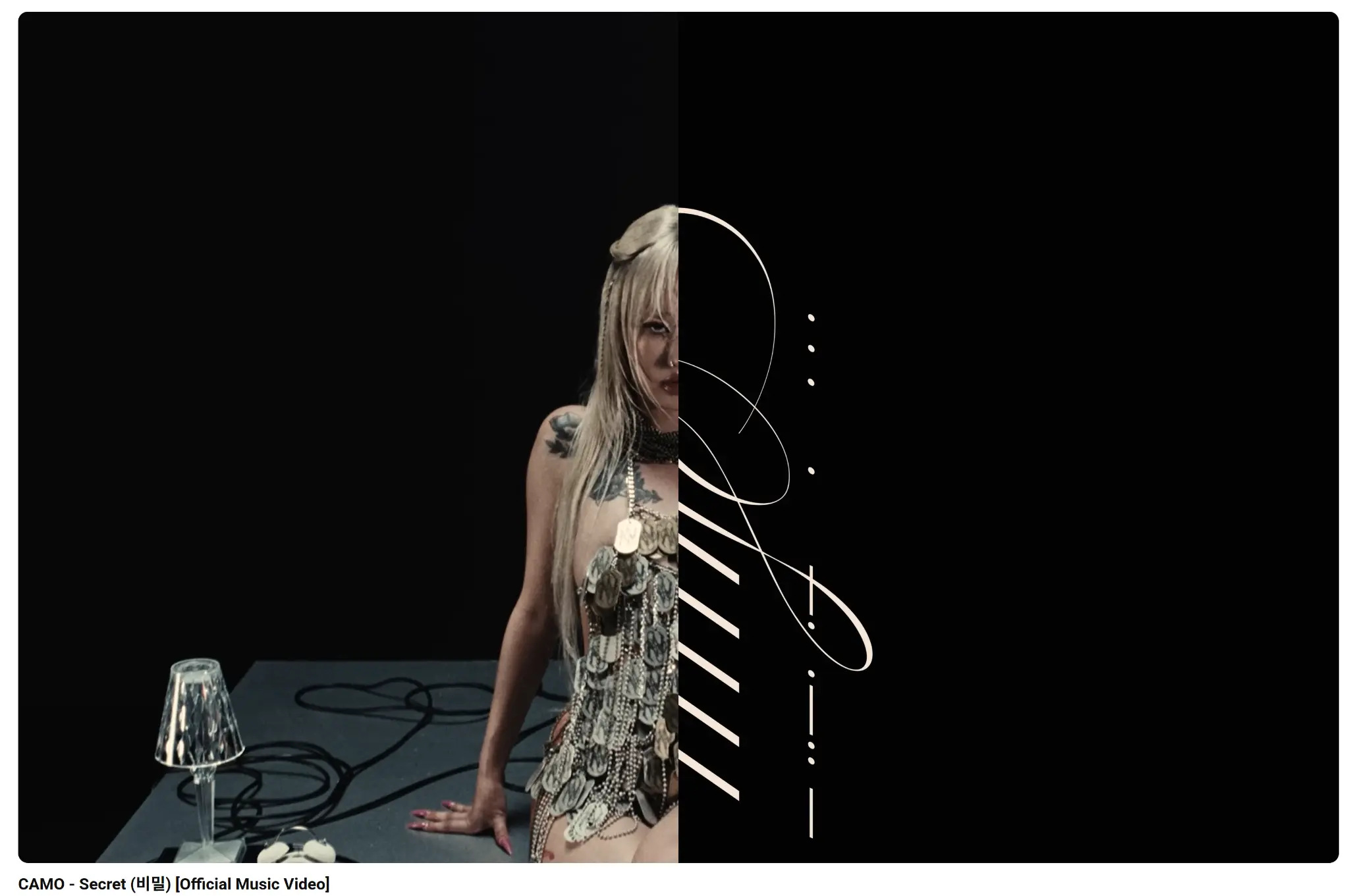
The moment the album art for Secret dropped, it was clear that CAMO was signaling a profound shift, not just in her sound, but in her entire artistic presentation. This wasn’t just a cover; it was a carefully constructed visual manifesto, a key to unlocking the sonic world contained within the tracks. The aesthetic choice is a masterclass in controlled minimalism, using a limited palette and stark composition to convey a sense of mystery, maturity, and undeniable power. It immediately sets the tone for an album that is less about the vibrant, sometimes chaotic energy of her earlier work and more about introspection and the deliberate unveiling of layers.
The Allure of the Monochromatic Palette
The most striking element is the near-monochromatic color scheme. Dominated by deep, velvety blacks and cool, almost sterile whites, with only the slightest hint of a muted, steely gray, the artwork eschews the bright, saturated colors often associated with Pop-Rap. This choice is immediately evocative of classic film noir or high-fashion photography, suggesting a narrative depth that goes beyond simple musical promotion. The black isn’t just a background; it feels like an abyss, a space of infinite possibility or perhaps a void where secrets are kept. The white elements, conversely, act as sharp, deliberate points of light, drawing the eye to the central figure and the album title. This high contrast is not merely decorative; it’s functional, creating a visual tension that mirrors the emotional push and pull of the music itself. It suggests that the “secret” is something hidden in the darkness, only partially illuminated by the truth.
The typography is another critical component of this visual strategy. The font used for the album title, Secret, is clean, modern, and slightly elongated, giving it a sophisticated, almost architectural feel. It’s placed with precision, often small and understated, forcing the viewer to lean in, both literally and figuratively, to grasp the message. This subtlety is a powerful move. Instead of shouting the album’s name, it whispers it, aligning perfectly with the theme of the title. The artist’s name, CAMO, is handled with similar restraint, ensuring that the focus remains on the conceptual weight of the album rather than just the celebrity of the artist. The overall effect is one of quiet confidence, a visual language that says, “I don’t need to be loud to be seen.”
A Study in Compositional Depth
The composition of the main image is a brilliant exercise in negative space and implied narrative. Often, the central figure of CAMO is positioned off-center or partially obscured, a deliberate choice that enhances the theme of concealment. She is not presented in a typical, direct gaze; instead, her posture might be turned away, her face shadowed, or her eyes downcast. This creates an immediate sense of intrigue. Who is this person, and what are they hiding? The use of shadow is particularly masterful, sculpting her features and clothing in a way that makes her seem both vulnerable and untouchable. The shadows are not accidental; they are part of the design, acting as a second character in the visual story.
The artwork for Secret is a visual paradox: it is both utterly exposed in its starkness and deeply concealed in its use of shadow and subtle composition.

The textures implied in the artwork are also worth noting. While the image is flat, the high-resolution photography suggests textures that are rich and tactile—the smooth, reflective surface of a piece of jewelry, the soft drape of fabric, the slight graininess of the film stock. These implied textures add a layer of luxurious detail to the otherwise sparse design. It’s a visual feast for those who take the time to look closely, rewarding the viewer with small, intricate details that reinforce the album’s high-end, polished production value. This attention to detail elevates the artwork from a simple promotional image to a piece of contemporary art.
The Symbolism of the Unseen
The visual aesthetics of Secret are heavily invested in symbolism, particularly the symbolism of the unseen or the partially revealed. Consider the recurring motif of hands or fingers. They might be covering a mouth, shielding eyes, or simply resting in a gesture that suggests contemplation or the act of holding something back. This is a direct visual translation of the album’s title. The hands become a physical barrier between the artist and the world, a representation of the internal struggle to keep or reveal a truth. It’s a deeply human gesture, and its inclusion grounds the high-concept aesthetic in relatable emotion.
Furthermore, the choice of setting, when one is present, is always minimal and abstract. There are no busy street scenes or elaborate backdrops. Instead, we see clean lines, empty rooms, or perhaps just a single, isolated light source. This lack of environmental context forces the viewer to focus entirely on CAMO and the emotional state she is conveying. The environment is stripped away, leaving only the essential elements of the secret and the person who holds it. This is a brave artistic decision, as it relies entirely on the strength of the central image to carry the weight of the album’s theme.
- The use of high-contrast black and white to create drama.
- The subtle, sophisticated typography that whispers instead of shouts.
- The compositional use of negative space to imply mystery and isolation.
- The recurring motif of hands and shadow as symbols of concealment.
A New Era of Artistic Identity
The visual identity of Secret marks a significant evolution for CAMO. It is a clear statement that she is moving beyond the expectations of her earlier, more overtly energetic persona. This artwork is mature, sophisticated, and deeply conceptual. It aligns her not just with contemporary music artists but with a broader tradition of visual artists who use minimalism and high contrast to explore complex psychological themes. The aesthetic is a deliberate pivot, one that suggests an artist taking full control of her narrative and presenting a version of herself that is more guarded, more thoughtful, and ultimately, more compelling. The album cover is not just a wrapper for the music; it is the first track, a silent prelude that prepares the listener for the journey into the depths of the Secret. It is a bold, beautiful, and enduring piece of visual communication that will undoubtedly define this chapter of CAMO‘s career. The entire package—the music, the title, and the stunning visual aesthetics—works in perfect, chilling harmony.